
Open to the community
David Mando & Co is a law firm previously named Kyonne Chambers by it’s founder. Kyonne in native language translated to english means community. The big idea behind the firm is openness to the community. A firm that strongly believes in the well being of the community.
A strong visual identity was created to depict the core value of the brand and amplify its mission.
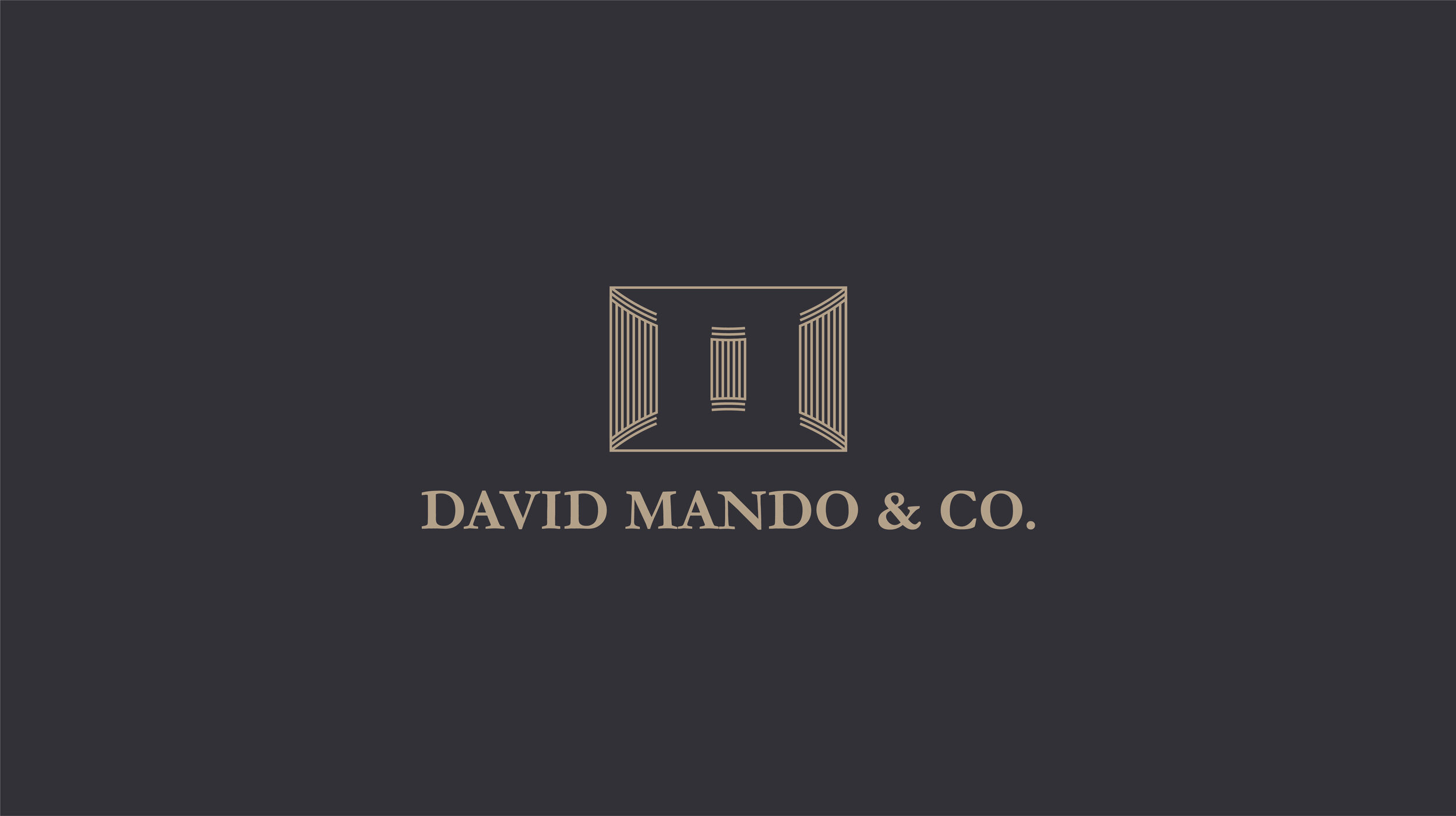
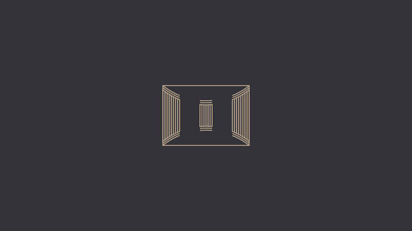
Icon concept
The icon is an open chamber at first glance. The curvy nature exhibits an open and welcoming feel. The outline of columns depicts the historic architecture of court buildings. The negative (empty space) in the logo forms a judge’s gavel.
When you view the mark from top view, the first curve fully connected is the letter D. The 3 columns are balanced on both ends in reference to justice. It also is the letter M.
Consistent visual system
The font chosen (Garamond) is a traditional and classy font to suit the visual language of the firm. This ensures all brand messaging is consistent.
The rich grey color evokes a feeling of fairness and togetherness. The gold is all class, the high value the firm adds to clients and the community at large.

Corporate identity
The icon can exist either in a portrait or landscape view depending on application. This has been translated on corporate materials.


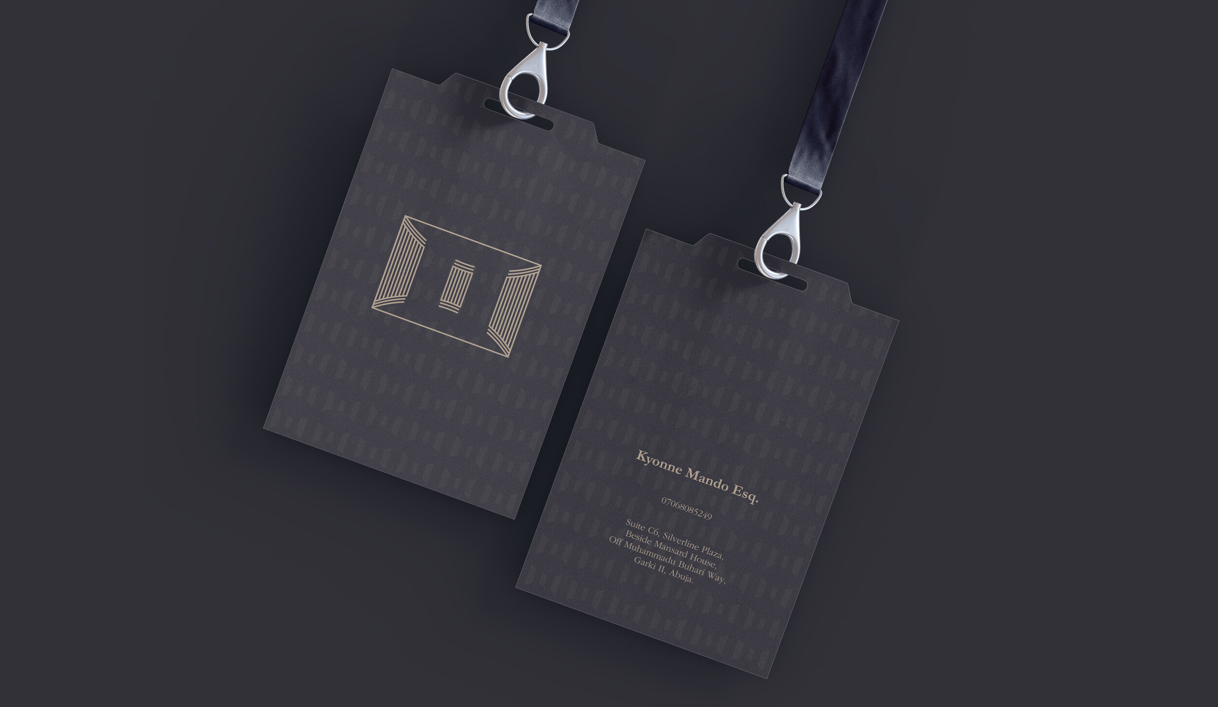
Testing the system in reality
The mark has been placed on related mock-up environments to test the functionality of the mark on various surfaces. The test ensures the mark is not only usable on plain surfaces.


Looking ahead
Grateful to have been a part of this project. A custom invoice was later designed in alignment with the identity system. Always ready to work on future marketing projects like a website design. Best wishes to the community and everyone.
