
Minimal with functional aesthetics
DK Architecture is a start up architectural firm with core values of minimalism, functionality and aesthetics. The firm aims to be a key player in the real estate and development industry. It’s founder is a high school friend and adored by everyone mainly due his calm and playful spirit.

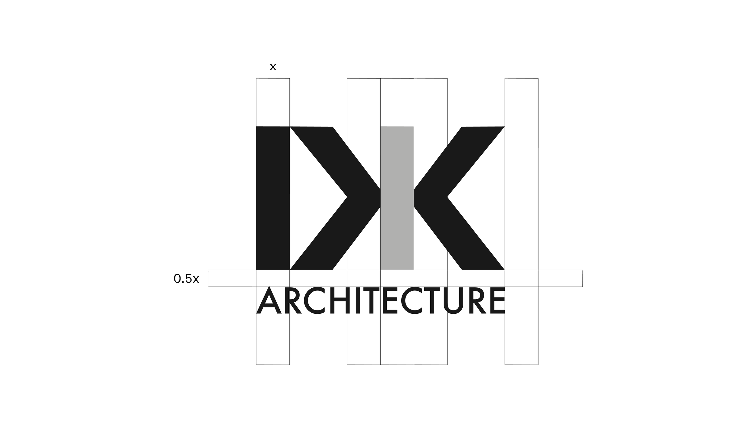
Logo concept
The word-mark is a play on architecture. Letters D and K form a simple structure, with an aesthetic view. The letters are cut in perfect alignment as though the logo itself was a building. The empty space in letter D forms a play symbol that connects with personality of the founder. More obviously, the shape of a set square / triangle is formed by the empty space in letter D.
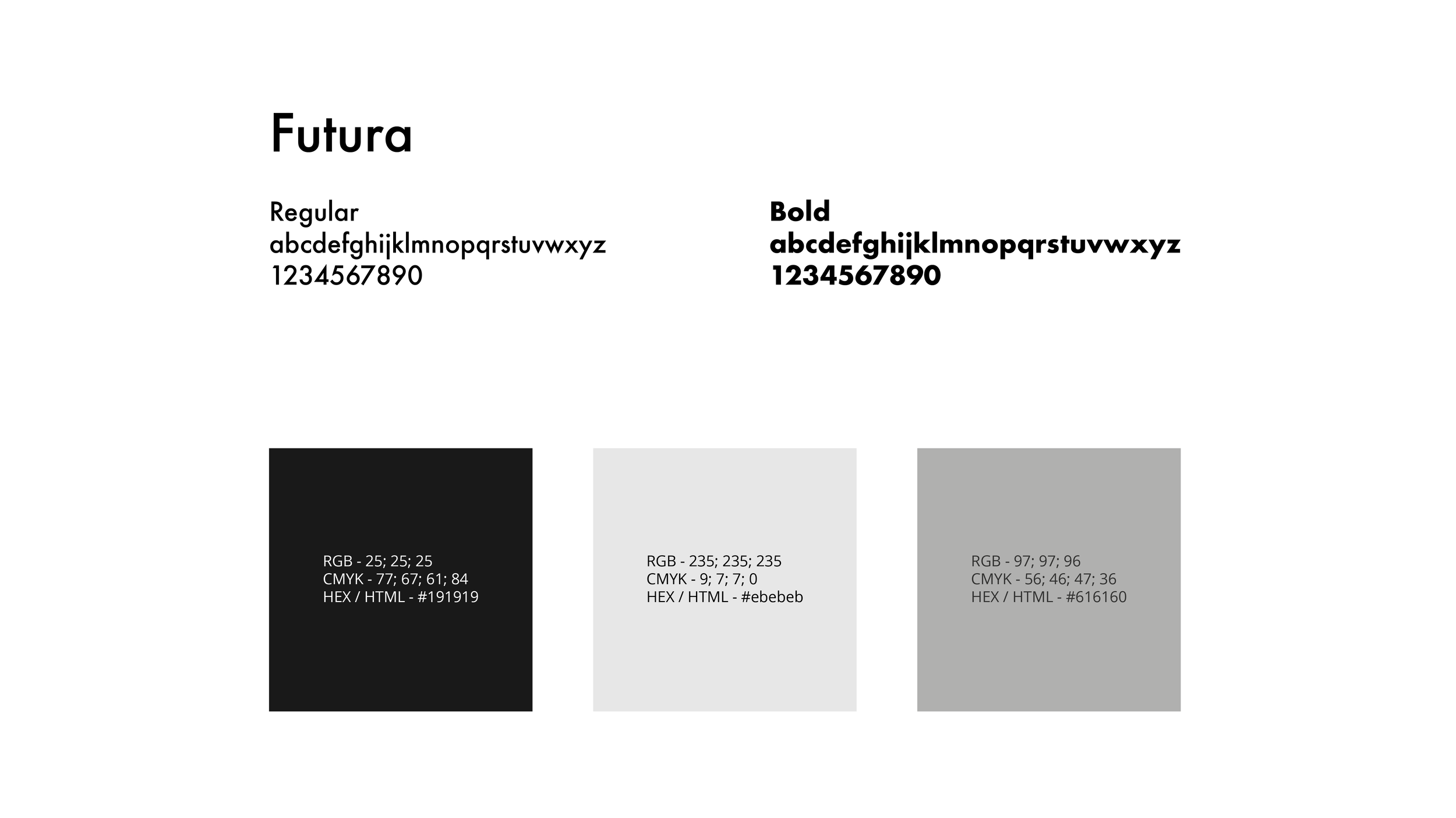
Typography / Color palette
A consistent typeface and color palette keeps the brand message consistent and memorable. A single typeface with a wide variation of font sizes and weights is used. The minimal selection choice serves all messaging content in different styles. The color palette is minimal and reflects the skeletal working structure of a building drawing.
Corporate function
A secondary asset to function as a directional element on brand extensions like business cards, has been incorporated in firms visual language.


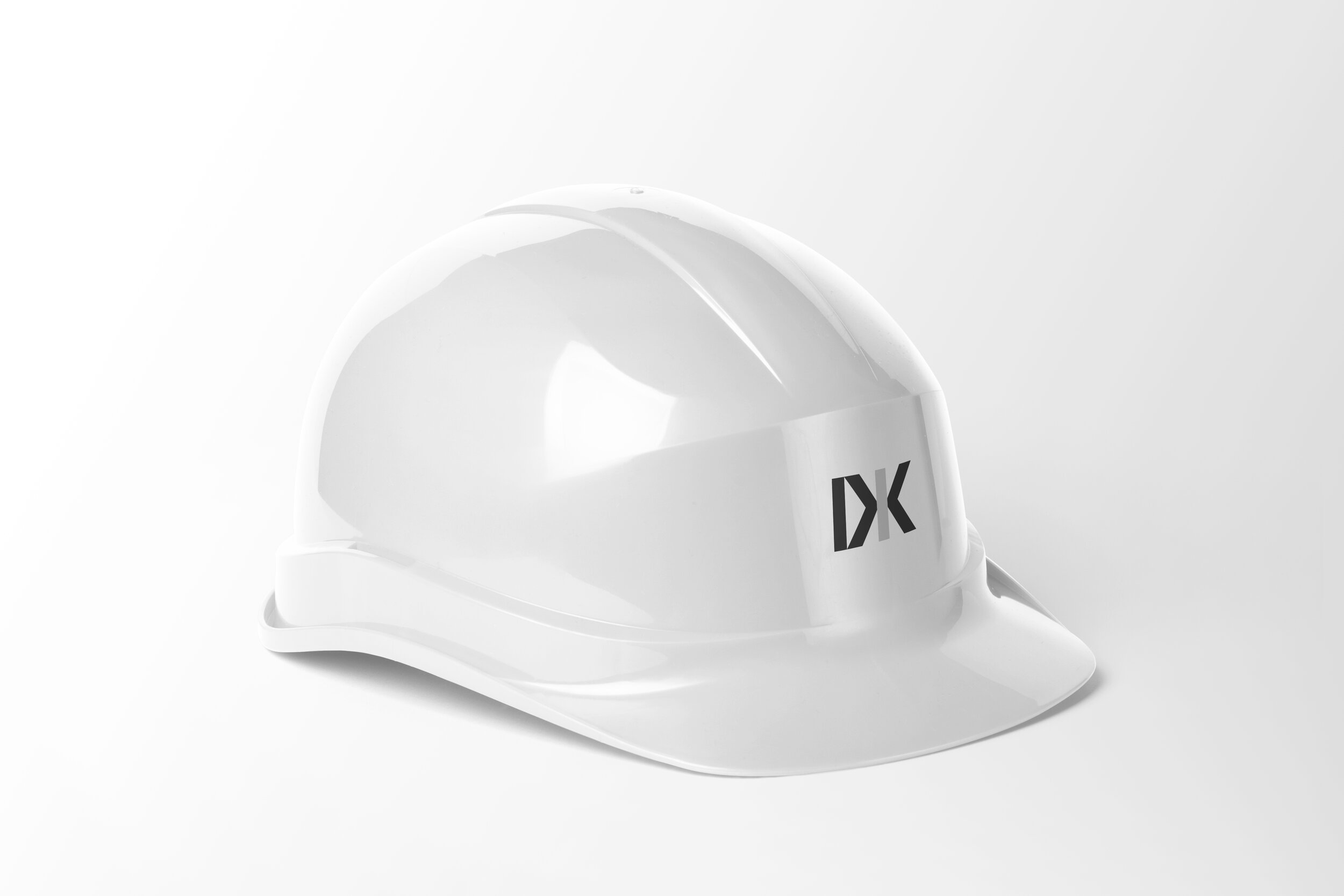
Realistic mockup
Mockups are used to test the functionality of the unique word mark on different surfaces. The materials and environments used are relevant to the industry the mark is likely to exist. This ensures the mark is functional and can stand the test of time.

The path forward
Grateful to have been a part of this fun and functional project. All brand assets have been handed over to the firm with clear labels and instructions for application to ensure the brand identity stays consistent. We keep communications lines open for continued brand strategy, advertorial materials and simply to say hello. Wish DK Architecture all the best.
