Leader in the Agro value chain
TAK Group is a value chain service provider in the Agro industry. Over the years the group has evolved from being a trading company to a group of companies that covers manufacturing, commodities trading, logistics, storage and warehousing, and agro inputs in the agricultural sector.

The symbol
The symbol represents the agricultural value chain. The icon is triangular in shape which depicts value, dynamism, stability, trust, speed and growth. The color yellow represents energy, prosperity, rich harvest and growth. Green is nature, nature is life. The color combination is sustainable agriculture.

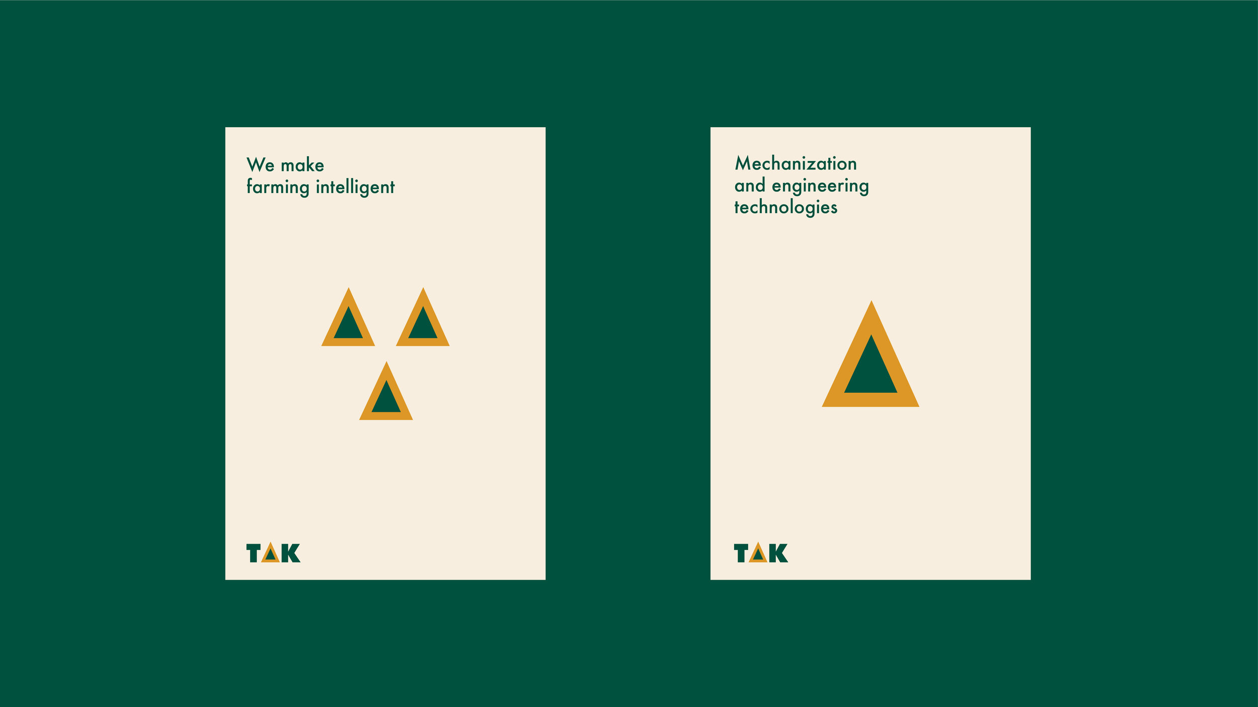
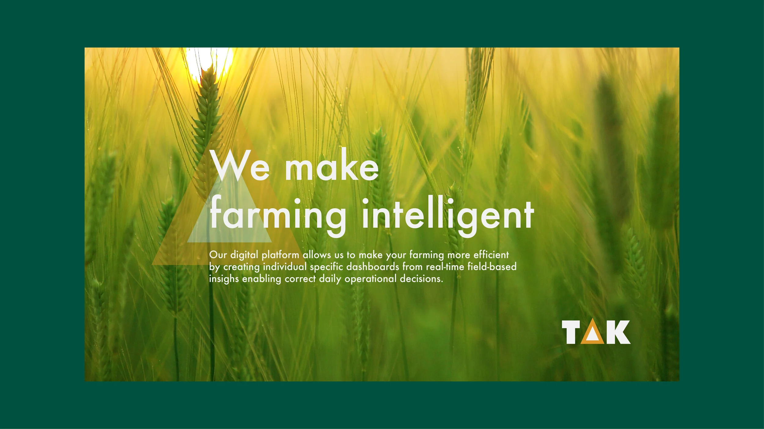
Elements of the corporate identity
The symbol can act as an independent element of the corporate identity. It can function in the form of an outline, with transparency or in it’s fill form. This is utilized in advertising layouts, web applications and other forms of brand messaging.


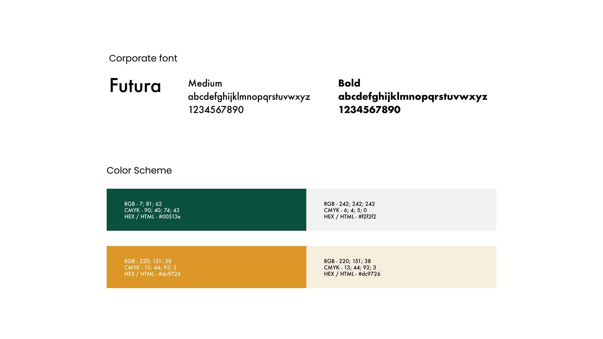
Corporate identity
A fine blend of brand elements create a unified and consistent brand identity.

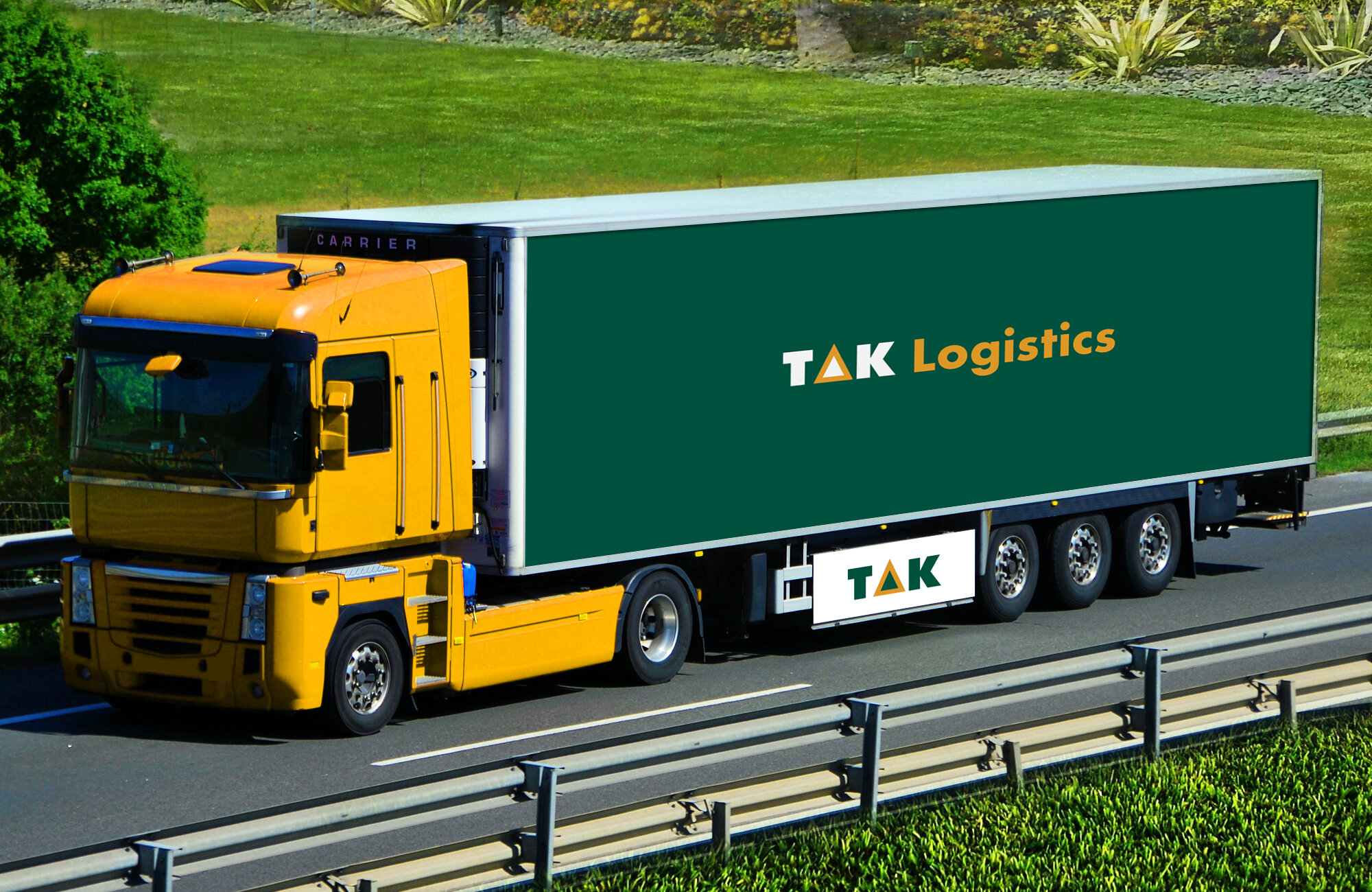
Testing the identity system
The logo has been applied on various surfaces related to the brand. This is to ensure it can function on other related ventures given the rapid expansion of the TAK Group of companies. This ensures the logo is timeless and functional across board.


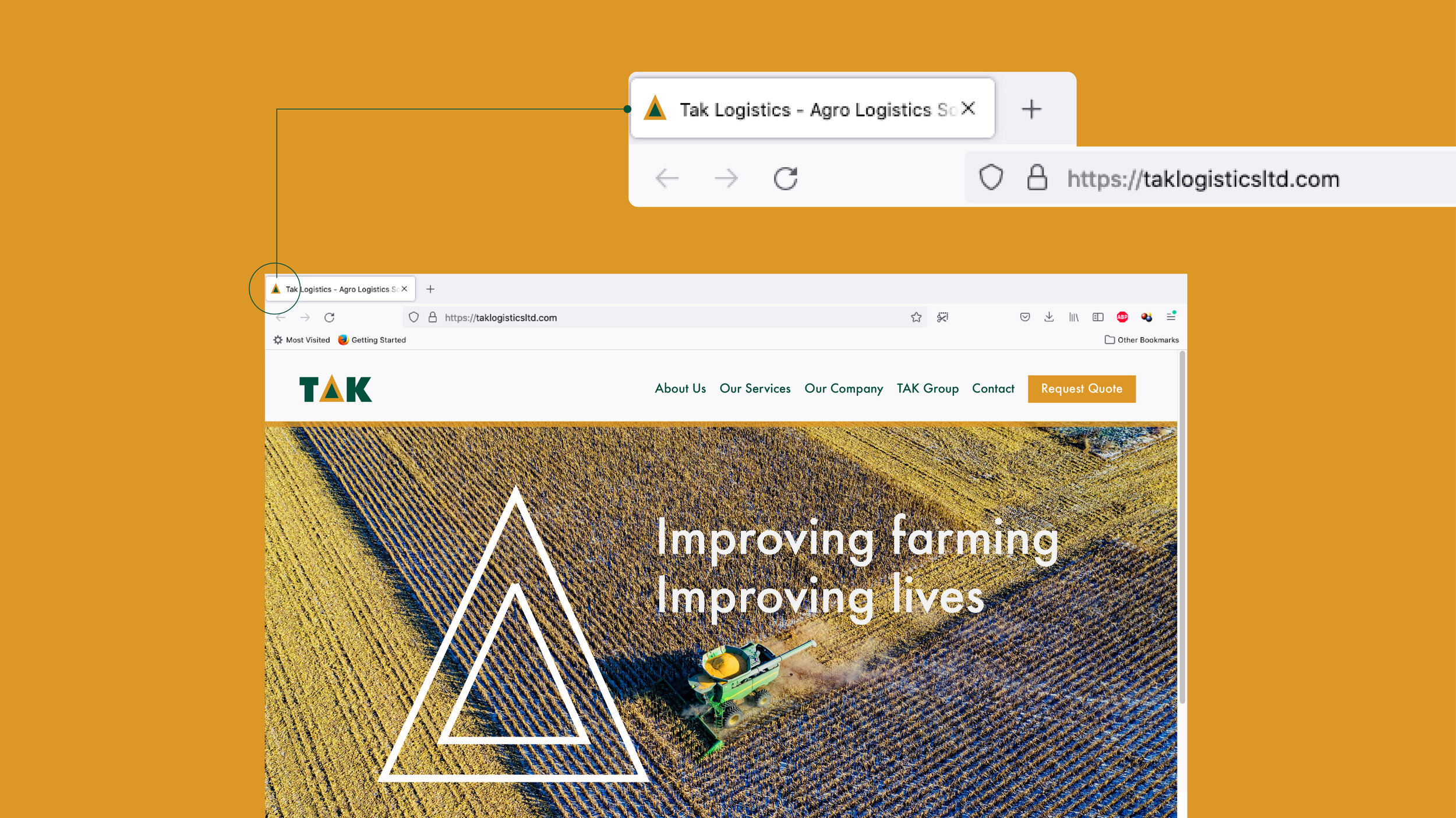
Digital application
The symbol extends as a Favicon on a web layout. It is essential the brand identity system functions effectively across digital platforms.